

6th November 2026
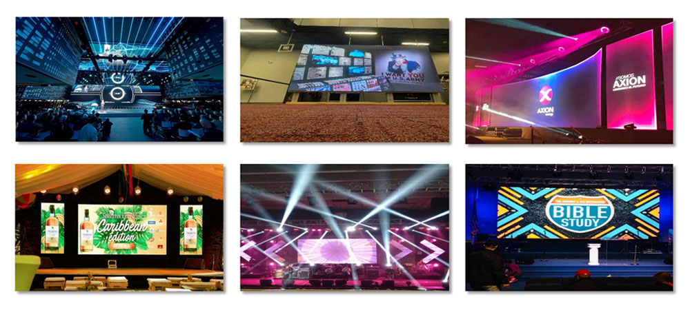
LED Stage Backdrop Content That Keeps Performers Visible
-
 author

A stage background needs to leave plenty of room for the person standing there. Think about a speaker explaining a difficult idea. At the same time, bright graphics flash right behind their head. Those images might look great by themselves. But the mix forces the crowd to watch two separate things at once. Rental crews, event planners, and AV techs have to check this mixed view carefully. They do this while setting up the display files.
The performer sets the visual hierarchy
The spot where the speaker stands gives the designer a helpful guide. You need to mark this area on your screen draft. After that, place the biggest graphics around that mark. Next, put a real person into the shot. Does the layout make their face and hand movements easy to see? Or do people keep looking back at the moving pictures?
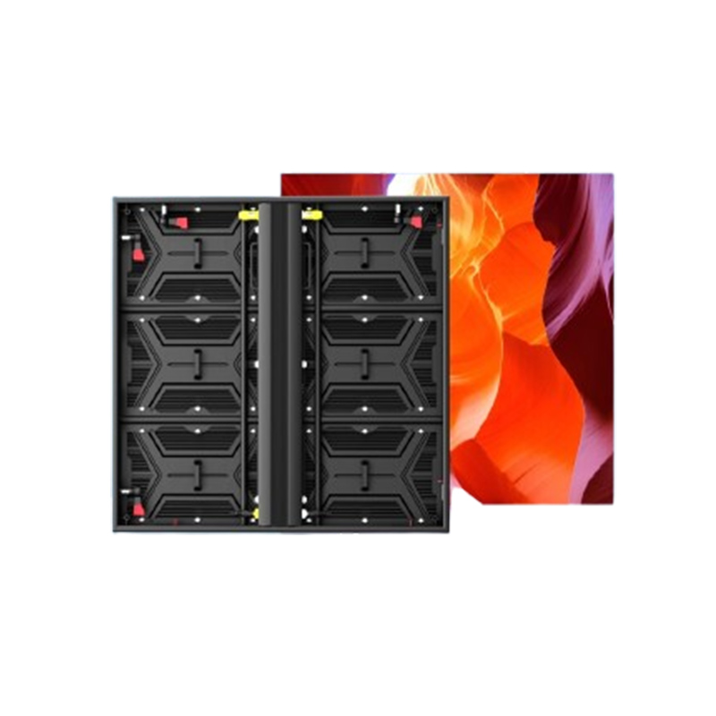
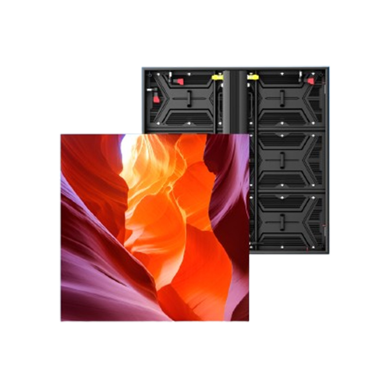
An LED backdrop screen functions as a key piece of the whole stage setup. For a normal business meeting, try a quiet background. Put the main event logo far from the speaker’s face. For a live show, let motion and bright colors build the right feeling. At the same time, make sure the people in the front stay easy to see.
Making two different drafts of a scene helps you spot visual clashes easily. First, build a very busy animation. Second, make a plain option. Next, play both files while someone says a few words on stage. You never have to guess which file highlights the speaker better. Just look at the two choices from the guest chairs.
Space around faces and text
Names need plenty of blank room, just like faces. You should type the longest speaker name into your file. Do this before you accept a short test name. Test this long word over the base background pattern. After that, ask the presenter to step away from the center mark. Watch out for any weird graphic clashes.
Movement during speech
Screen motion needs to fit the exact moment in the show schedule. A big entrance offers a totally different chance for art than a deep tech talk. Try a static picture or a very quiet loop while someone talks. You can save the busy video clips for a break in the schedule. Always test your choices against the speaker’s actual actions.
The real pixel canvas shapes the artwork
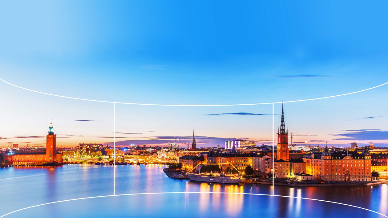
Digital artwork must match the native pixel resolution of the LED wall. A normal widescreen video does not just fit onto a long ribbon shape. It also fails to cover a tall setup without special tweaks.If a circle becomes distorted on screen, this error will be immediately visible. This same stretching issue will ruin a company logo or a human face.
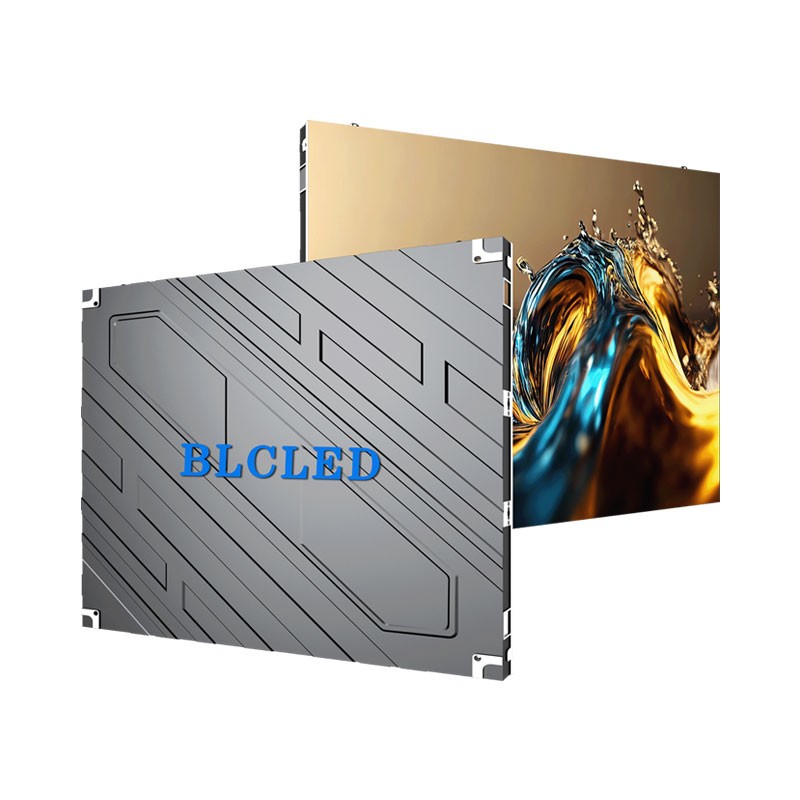
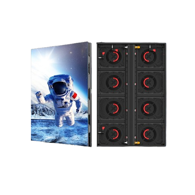
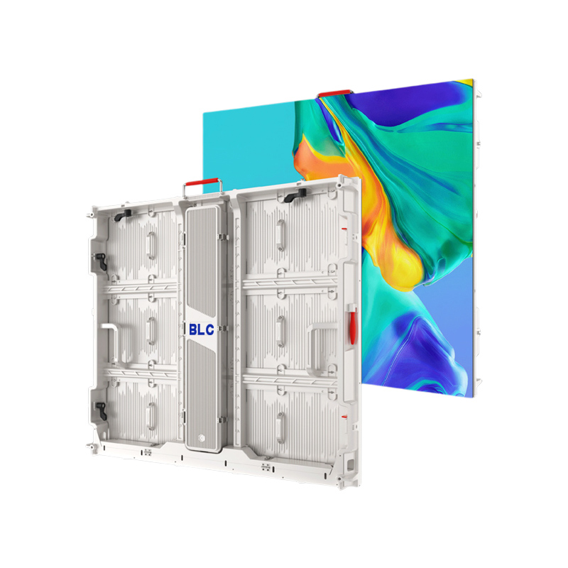
Real cabinet details make this size rule very clear. For example, BLC LED’s indoor BHR P2.5 setup packs 200 × 200 pixels inside its 500 × 500 mm cabinet. So, a test wall built ten cabinets wide and six cabinets tall creates a 2000 × 1200-pixel space. That whole structure measures exactly 5 × 3 meters.
That certain stage LED video wall uses a 5:3 ratio, instead of the normal 16:9 shape. You have to build the art just for those exact sizes. Or, you can place a normal video right inside that bigger area. This sample talks about one indoor BHR setup. It does not share the same pixel map with other pixel pitches or outdoor models.
The farthest chair acts as a great place to check text clarity. Look at the longest real name, the smallest needed text, and the busiest logo from that very spot. A basic laptop screen stays handy for quick edits. But it totally fails to show the real physical gap between the crowd and the stage.
Different programme moments need different backgrounds
Schedule shifts give the screen a good reason to shift too. A simple intro clearly names a certain person. Next, a serious speech needs plenty of room for the main point. On the other hand, a music act might call for a much heavier visual mood. You need to give every scene on the LED wall stage backdrop a clear job. Do this before you paint any extra details.
| Programme moment | Main visual job | Rehearsal question |
| Speaker introduction | Show the person clearly | Is the full name easy to read from the back? |
| Detailed presentation | Keep focus on the talk | Does the art fight with the slides? |
| Performance | Boost the mood and the front view | Are the people easy to spot? |
| Programme transition | Show a shift in the schedule | Does the picture fit the next step? |
A shared graphic theme leaves plenty of room for many unique layouts. You can take one color group or a main shape across several scenes. After that, change the words and the motion to match the current part of the show. A sponsor page with many names needs a longer reading time than a mood video played during a song.
Cameras reveal a second version of the stage
Taped and live-streamed shows need a second vital viewing spot. This is the view from the video camera. You have to check the LED video backdrop in the planned wide angle and the tight zoom.Look closely at the borders of the camera lens, along with the absolute center. A name that looks perfectly fine on the full wall might get cut off badly in a tight shot.
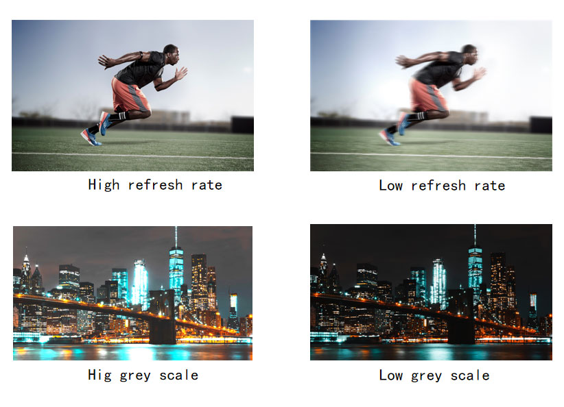
Repeating visual shapes are always worth testing right on the camera screen. If ugly moiré patterns pop up out of nowhere, try a plainer picture. Do this while the camera crew checks their angles and focus levels. You need to save the exact file that looks right in the final shot. One good screen setup does not mean it will work for every single camera angle.
The official lighting practice totally needs real faces and clothes on stage. Previewing bright content on the LED wall without a person on stage gives little insight into real world color balance. Color performance changes significantly once the speaker steps in position. You should gather the light and video techs together. They need to fix the levels as a team while a real person stands on the mark.
Rehearsal turns a design into a useful backdrop
The real show timeline acts as the best practice tool. Whether you use concert screens or a basic meeting setup, run the planned files in the right order. Always put a real human on the floor. You need to pay close attention to these key steps before you say yes to the final look:
- The speaker standing totally still and then walking across the marked talking zone.
- The smallest font size and the longest name truly used in the show.
- The brightest planned screen file checked next to the real stage lights.
- The visual jump from the last frame of one video straight into the next one.
A backdrop that supports the programme
The final sign-off step looks at the stage view as one big piece. Keep the digital files perfectly sized for the real physical screens. Check each show part with its main speaker standing right there. If the faces, the names, and the main point stay easy to track from the chairs and the cameras, the screen is doing its job well.
If you have any special needs, please reach out to us today.
FAQ
What content works well behind a speaker?
A quiet, simple layout acts as a very helpful starting spot. You need to leave plenty of blank space around the speaker. Keep all important names easy to read. Test any video motion fully while someone talks. Finally, check the final look with a person standing on the real stage mark.
Does backdrop artwork always need to be 16:9?
Screen art must strictly match the wall’s real physical shape and its exact pixel map. A normal video file can sit inside a wider or taller layout. However, its cut edges and any blank spots need careful, smart planning.
How much text belongs on a stage background?
You should only show the facts the crowd truly needs at that exact minute. Test the longest text line from the farthest chair in the room. After that, cut down anything that visually fights with the speaker or the main slide deck.
Why review the backdrop through a camera?
A video camera frames and tapes the stage very differently than a seated guest does. Checking the planned camera views uncovers annoying screen patterns. It also shows weird cut-offs and bad brightness levels. You have to fix these problems before the real show or the taping starts.
Is the same background suitable for every event segment?
Different show parts hold different visual goals. You should keep a shared overall graphic style. But you need to change the text amount, the video motion, and the main focus. Do this carefully for guest intros, deep talks, live acts, and schedule shifts.


Leave a reply